MOST
STYLISH
NEW YORKER
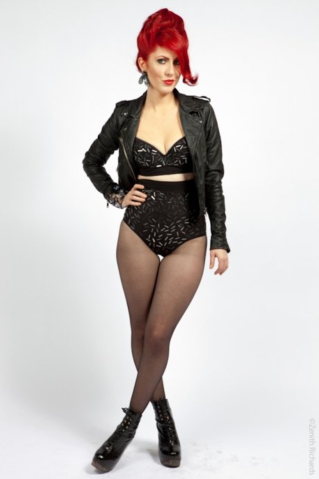
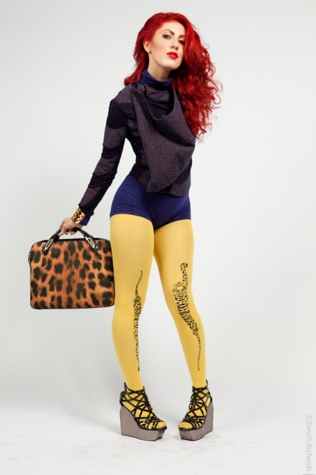
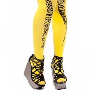
The stylist’s bold fashion sense has us seeing red; we show you to get her look.
Photograph: Zenith Richards
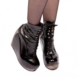
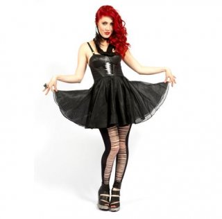
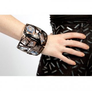
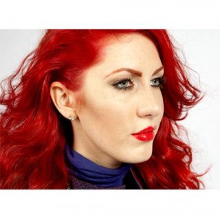
Valissa Yoe, 27; fashion stylist, makeup artist and DJ (valissayoe.com); East Village
Her personal style: “If I may quote good ol’ Coco Chanel, ‘A girl should be two things: classy and fabulous.’ It’s versatile, showstopping and super vixen all with a touch of class. People say I look like Jessica Rabbit, so I play that up a bit too! Overall, I believe personal style is all about the confidence you have and exude.”
Her inspirations: “The originators and innovators who create these pulsating city streets, clubs and galleries. Leigh Bowery, Andy Warhol and Alexander McQueen have been overwhelming influences in my life.”
Favorite stores: “Seven New York is at the top of my list. It showcases the most progressive independent designers from around the world. The store’s designed with an art-gallery feel, so you want to touch, analyze and own every piece. Jeffrey New York is the boutique version of a high-end department store. The designer selection and service is impeccable. Patricia Field was one of the first stores I visited when coming to NYC. It’s a Disneyland of all things glitz and glam you will see on celebrities, club kids and tastemakers alike. Patricia Field has also been a great influence in my career as a fashion stylist.”
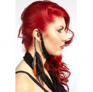
Her signature accessories: “My fiery red hair and handcrafted silver ‘V’ necklace my mother gave to me.”
Favorite designers: “Christian Civera is the kind of designer that has a profound understanding of the body and emotion. His silks, patterns and drapes make a woman feel like a woman! Jules Kim, the jewelry designer behind Bijules NYC (bijulesnyc.com), is a visionary sticking to her aesthetic and being respected by every relevant, trendsetting woman you can think of. She makes your wildest dreams a reality, dipped in gold. Kerin Rose’s (a-morir.com) ‘go big’ attitude and glam appeal to no end, making her an eyewear designer to the stars. Eye-catching to say the least, Kerin and I are mistaken for each other on a daily basis!”
How she describes New York style: “It’s about functionality, sensuality, sophistication and individualism. New Yorkers encompass cultures from around the world and we make it our own.”
How her style has evolved through the years: “It’s evolved as I have evolved as a person. I lived in the suburbs of New York with a highly artistic family, moved to NYC, studied at FIT, designed for Kai Milla (kaimilla.com), and now work as a fashion stylist, makeup artist and DJ in the city. Every step in my life journey has created me!”
Via: Time Out New York
NEW YORKER
STYLISH
MOST
Kazuki Guzmán
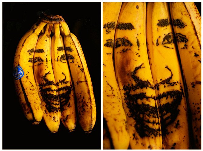
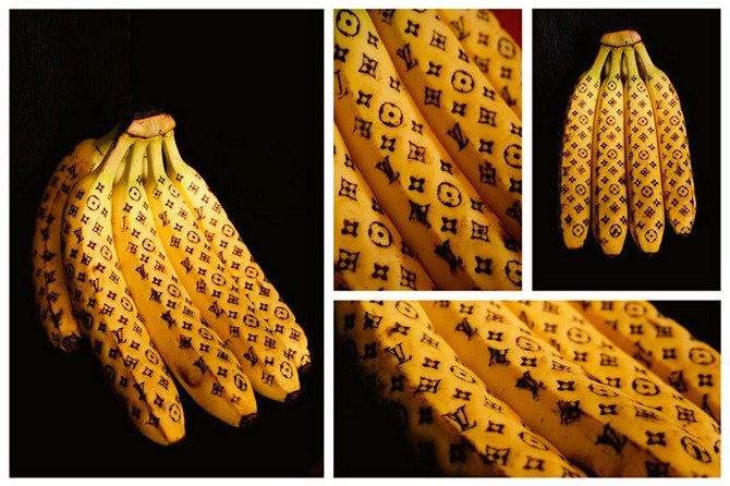
High Fashion Bananas
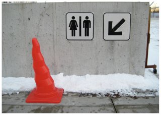
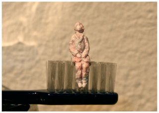
These banana as object artworks are incredible. I also think I like the idea that the work itself rots away and it can only exist afte by photograph. There's something really human about that.
As he says on his site “I enjoy taking jokes seriously, until they become ‘art’ in one way or another. My artworks are often the accidental outcome of playful interactions between the materials and myself.”
Artist Bio:
In a way, even my name ‘Kazuki Guzmán’ is an important reflection of my unique heritage. My father is a macho Chilean and my mother is a delicate lady from Japan. Because of them, my work reflects not only the things I love, but also my most essential character traits. My cultural background, my personal experiences, my family, friends, and hobbies are common themes shown in my pieces; the convergence of their disparate origins is an important part of what makes my work dynamic. I take confidence in my art and use it as a way of expressing my feelings, as well as my appreciation and love for the people, places, and things that make me Kazuki Guzmán.
Like my own history, my media is never fixed; my artworks range from large installations that are activated by the space or the viewers, to series of sculptures made from everyday objects. I consider my art practice as part of a playful exploration of ideas and materials. The notion of ‘play’ is at the core of my art practice. I enjoy taking jokes seriously, until they become ‘art’ in one way or another. My artworks are often the accidental outcome of playful interactions between the materials and myself. I equally enjoy allowing my materials to define the context of my artwork, and conversely, the challenge of letting the context of my work dictate the material execution. Most of my inspirations arise from mundane events: a trip to the antique store, revisiting children’s books and toys, or buying groceries. Most importantly, I strive for intricacy and exquisite craftsmanship in my work, while focusing on not loosing my very whimsical sense of humor and play.
Via: Kazuki Guzman
Isabeli Fontana

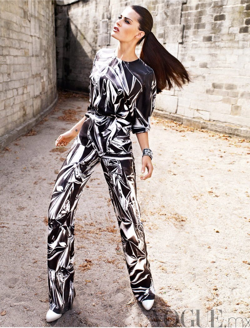
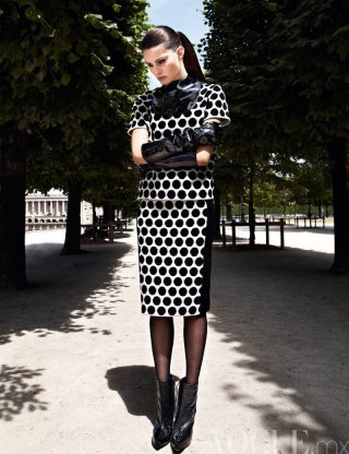
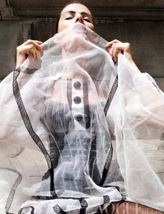
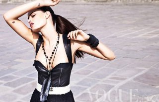

Isabeli Fontana photographed by Marcin Tyszka for Vogue Mexico September 2011
Via: Zac-Fashion
Bubbles of glass
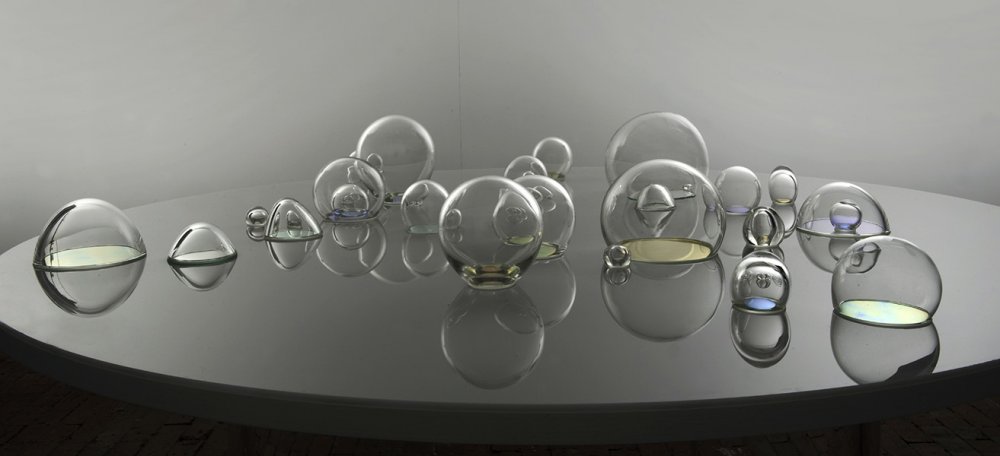
Using highly innovative materials such as NASA ’s dichroic glass, Bubbling Up examines the fragility of the Earth’s atmosphere and ecosystems that appear like a bubble, on the constant verge of collapse. Sometimes fickle and ever elusive, Bubbling Up highlights the ongoing need to quantify ecological concerns. Every day there are thousands of toxic gases bubbling up in the atmosphere. In the age of heightened ecological awareness Bubbling Up poses the question, is it possible to view a beautiful sunset and not wonder if the sky is set ablaze with such unique colours because of the toxic pollutants in the air reacting with the atmosphere? In the space that surrounds us, what is bubbling up?
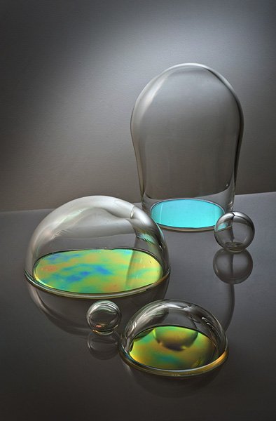
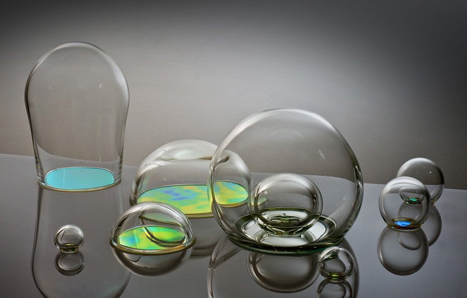
Jasmine Targett is bubbling it up.
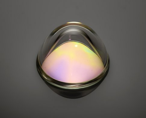
Source: Jasmine Targett
Photos of the Artists As Young Men
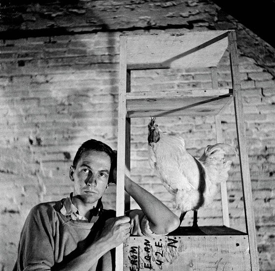
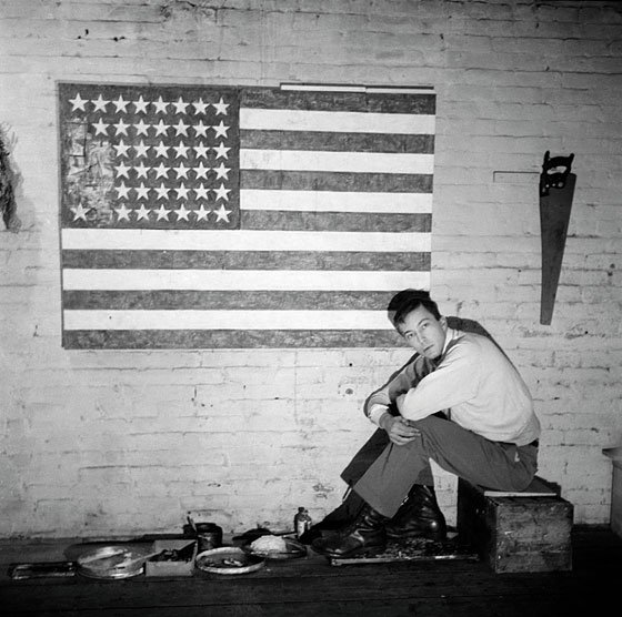
From the very beginning of his mad, ecstatic, always-experimenting career, Robert Rauschenberg was looking at photographs. His hungry eye absorbed them; then they reappeared in his paintings, sculptures, and prints, and especially in his combines—the new form he invented, neither painting nor sculpture but a visual-material manifestation of abstract poetry. Rauschenberg appropriated photos from books, newspapers, magazines, advertisements, other artists, art-history books, anyplace. He cut them up, used them whole, pieced them back together, whatever. Given his fecundity—and a spate of pesky copyright cases brought against him—it’s no surprise to learn he also took pictures himself. Lots of them.
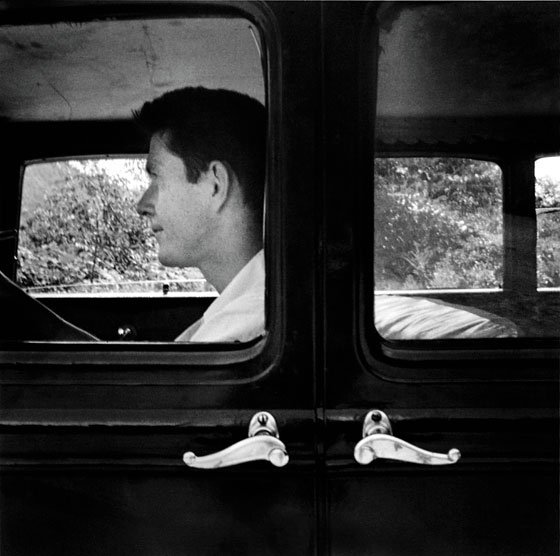
Yet there are surprises to be found in Robert Rauschenberg: Photographs: 1949–1962, an exhibition and book of 167 images from the years in which the artist invented his point-and-shoot style. Rauschenberg turns out to have been a natural, breezily brilliant with the camera, never more so than when shooting his circle of artist friends. We see Cy Twombly in Rome, dwarfed by an enormous Roman sculpture; a handsome Jasper Johns in his studio in 1955 next to his masterpiece Flag; an otherworldly Merce Cunningham crouched tigerlike in a motion until then unseen. These are closely observed windows into the nascent postwar art world. (The self-portraits of Rauschenberg—he was dashingly handsome, a young rake—with his work are no less revelatory.) There are images of grazing horses, landscapes, furniture, you name it.
by: Jerry Saltz
Via: NyMag.com
Richard
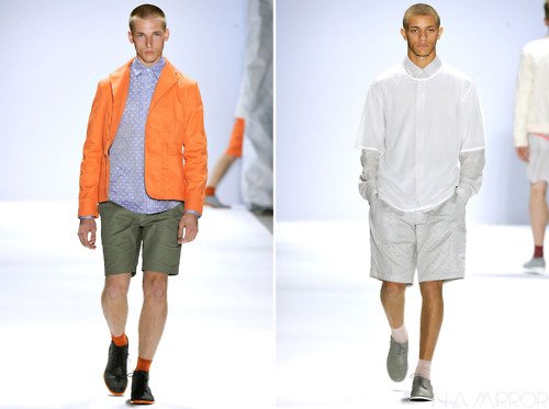
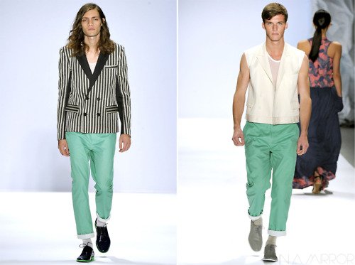
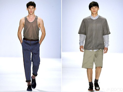
Chai
Love Spring/Summer 2012 Collection
Last March, the “New York Times” lamented in a commentary from David Pogue the demise of the sounds of the analog age. That scratching of a record as the needle leaves the vinyl, signaling the end of an album; the fast forward/rewind screeching zip-zip of a tape; the busy tone of a telephone; the “ka-ching” of a cash register. For the most part, none exist anymore.
So it’s the sound when entering George Sanchez-Calderon’s installation room at the de la Cruz Collection that feels the most immediate: it’s the click, click, click, flip, flip, flip of a train station sign changing times and destinations. The sound emanates from a real, giant Solari train station mechanism and is immediately recognizable to anyone (as in most of the world) who has traveled on trains. It is immediately identifiable as old-fashioned. The aural and visual aspect of the piece is also immediately nostalgic. Today, there are similar signs in airports, flashing updated times and gates, prompting a rush to new exit points — but they are silent. The digital age has left us mute without these telltale cues, which once became synonymous with “Modernism” and are now dated. Funny, isn’t it?
Sanchez-Calderon, whose quirky and engaging works have invigorated the Miami landscape for years, played with the idea of Modernism— its contradictions and its after effects — on a number of previous occasions. For instance, he erected an 80-percent-scale version of Le Corbusier’s classic Modernist house under a freeway overpass in Overtown, which stood for several years back in the early 2000s. On the one hand, here was a representative of “progress” as the Modern age once heralded, sitting in one of the most decrepit and neglected areas of any modern city in the world. As an artist, he is interested in both the literal and metaphorical architecture of our current era.
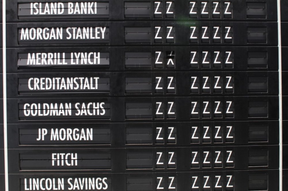
For his latest installation, called “The Family of Man” (a name appropriated from a mid-century MOMA exhibit from Edward Steichen), the big black-and-white sign flips and clicks, to tell us a new destination, a new time. On opening night, it included lots of repetitions of places, such as Providence (R.I.), and the same times, such as 6:66. Then, names of our corporate masters took the place of the “destination:” Wells Fargo, Merrill Lynch, Moody’s. Where, indeed, are we going?
“I began to look for and found a Solari sign in early 2009, shortly after the September market crash of ’08,” says Sanchez-Calderon about the inspiration. “An analog device that marked this transition, a marker of sorts for Modernism.” The work will change throughout the month or so that it is up. “It only gets better,” says the artist.
“The Family of Man” site-specific installation, through Oct. 8, at the de la Cruz Collection, 23 N.E. 41st St., Miami; www.delacruzcollection.org.
GEORGE SANCHEZ-CALDRON
Story on the new installation "The Family of Man."


Via: Knight Arts
By: Anne Tschida
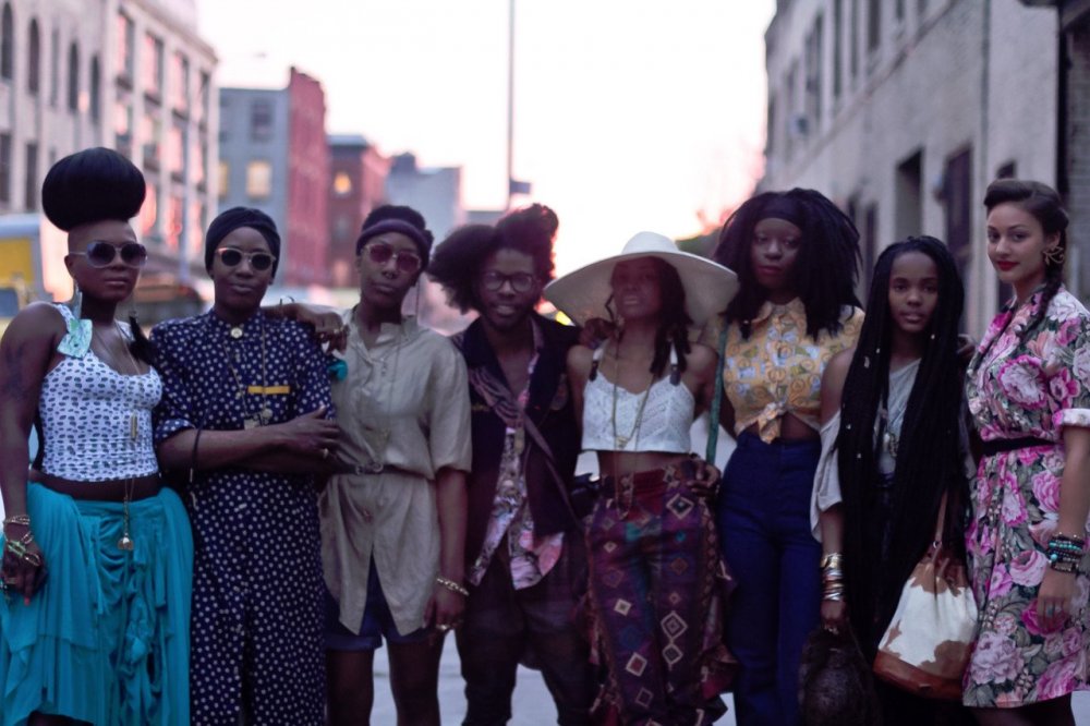
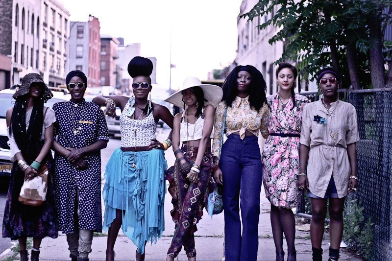
“Clothing is simply a form of expression to display what lies inside your true soul; you shop to find the clothing that dresses your constantly evolving spirit.
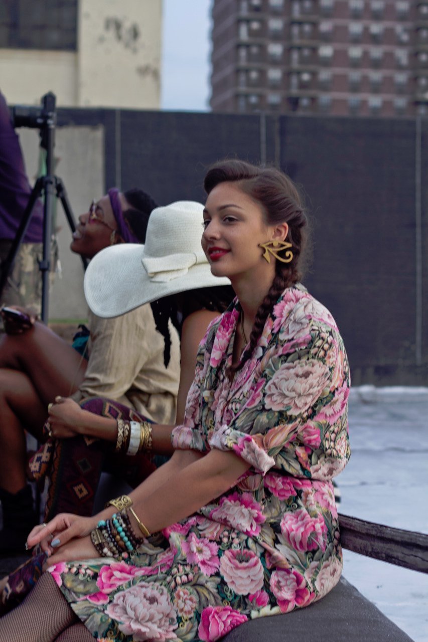
The Wardrobe of Choice
- Mara Hruby

Via: From Her Eyes
There is beauty in clothing that has history behind it, hence the pleasure of finding vintage pieces with an unknown story.”
Yes! Comic Tights!
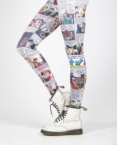
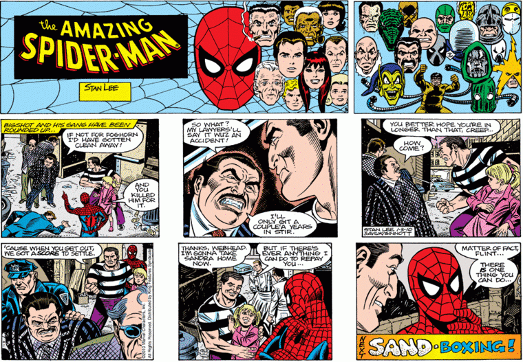
These are pretty geeky and sexy all at once. There is nothing wrong with that. I'm not sure what comic strip is printed on these tights since I'm no expert. But, I will say I would like them with Spider-Man or Wonder Woman please?
Anselm Reyle
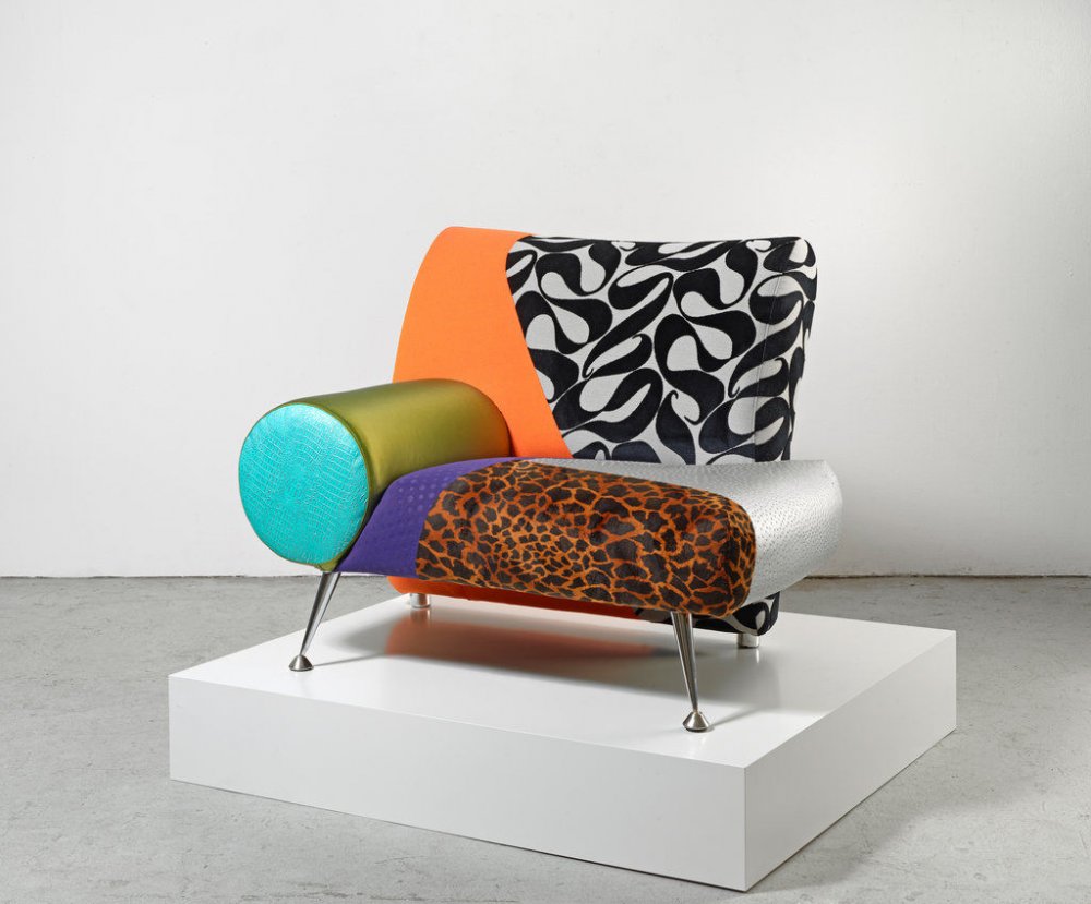
There's so much going on with this chair. As nutty and wild as it is I gotta say - I kinda like it!
Via: CFA - Berlin
The Allure of Louboutins photographed by Camilla Akrans for Industrie Magazine #1
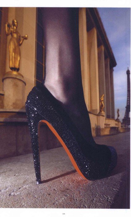
Blingy Pumps
Via: Ms. Pussy Le Queer
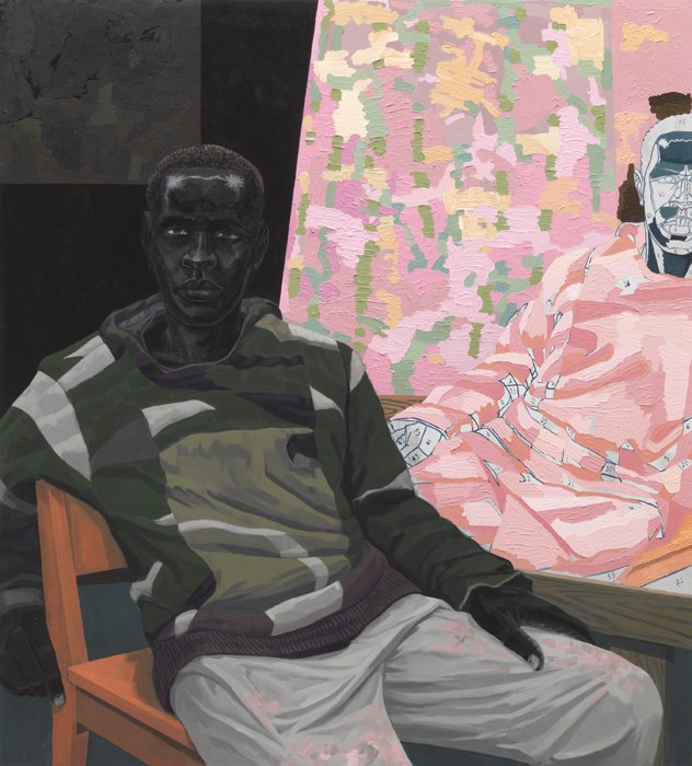
KERRY JAMES MARSHALL
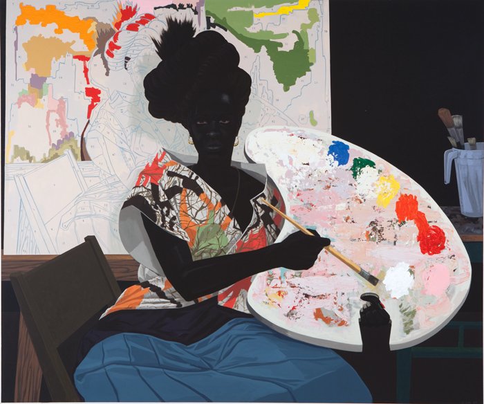
Untitled, 2009
acrylic on pvc
61 1/8 x 72 7/8 x 3 7/8 inches
Untitled (Painter), 2010
Acrylic on pvc panel
47 1/2 x 43 x 4 inches
Although he currently lives and works in Chicago, Illinois, his time spent in Watts, Los Angeles, California where he observed the Black Power and Civil Rights movements had a significant impact on his paintings). Strongly influenced by his experiences as a young man, he developed a signature style during his early years as an artist that involved the use of extremely dark, essentially black figures. These images represent his perspective of African Americans with separate and distinct inner and outer appearances. At the same time, they confront racial stereotypes within contemporary American society.This common theme appeared continuously in his work throughout the subsequent decades, especially in the 1980's and 1990's.
While earning his BFA from Otis College of Art and Design in Los Angeles, he worked under the notable Charles White and Arnold Mesches. At Otis, he developed his realist style after experimenting with large-scale drawings and collage, choosing instead to “mak[e] a meaningful picture that did not have a representational image or a specific story to tell,” over abstraction. Thus, Marshall still retains the political content so important to the Civil Rights Movement while painting a narrative through mural-sized pieces.
Madonna
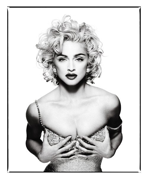
photographed by Patrick Demarchelier in 1990
See, even Disney princesses know how to rock the geek-chic look! It’s remarkable how a simple pair of over-sized frames can quickly transform Belle, Ariel, Snow White, Alice and her other Disney pals into hip, in-the-know cool kids. So funny! Get Snow White, Ariel + Alice’s Look for $88 w/ RX: The Jesse
Spex Club
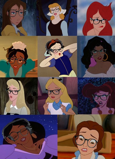
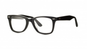
I love these, check out all the frames. Something for everyone...even Disney cartoons.
Via: Spex Club
Making a Princess look Cool
Born in Mexico City, 1972.
Lives and works in Guadalajara, México.
Co-founder and director of Oficina para Proyectos de Arte A.C. (OPA)
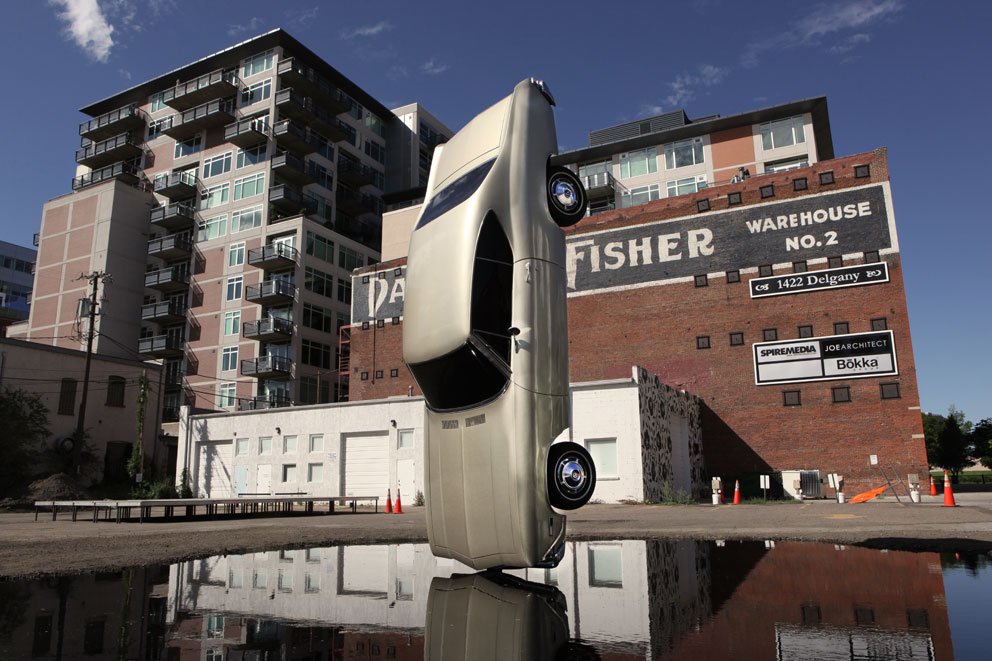
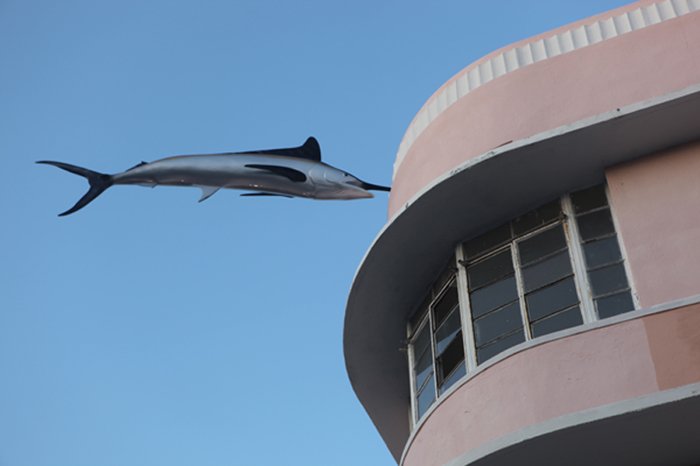
Gonzalo Lebrija
Gonzalo Lebrija
History of Suspended Time, 2010. Denver, USA
Gonzalo Lebrija
Black Marlin, 2009 - 300 cm x 120 cm - Bronze, fiberglass, paint.